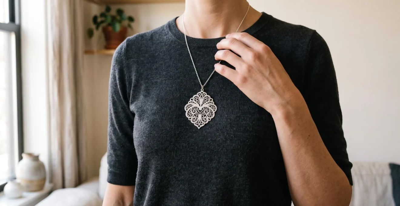
Ornate silver filigree can look distinctly contemporary without sacrificing the elaborate craftsmanship that makes it appealing. The difference often lies in how the piece interacts with clothing: its silhouette, surrounding textures, position on the body, and surface finish can make intricate metalwork feel intentional rather than theatrical.
The most effective approach is not necessarily to choose smaller or less decorative jewelry. Instead, give the filigree a clear visual role, surround it with complementary modern elements, and avoid recreating an entire historical jewelry ensemble. A sculptural cuff with a tailored shirt, an openwork pendant against a fine knit, or brushed silver earrings beside a structured neckline can each preserve ornament without suggesting a period costume.
These are practical styling principles, not universal rules about taste. Personal expression, cultural jewelry traditions, and deliberately maximalist fashion may call for a different balance. For someone seeking an everyday vintage-modern wardrobe, however, a few deliberate adjustments make ornate pieces easier to wear repeatedly.
Silver filigree styling at a glance
- Choose one focal point: let a prominent filigree piece supply most of the outfit’s ornament, while clothing provides visual structure.
- Match construction and placement to context: openwork, necklines, cuffs, and asymmetric arrangements can change how traditional designs appear.
- Control shine and layering: brushed or satin finishes and restrained companion jewelry often help filigree integrate into contemporary clothing.
- Why Ornate Filigree Overwhelms Minimalist Contemporary Outfits
- Open Filigree vs Filled Frameworks: Which Suits Casual vs Formal Modern Wear?
- How to Pair Filigree Pieces With Clean-Lined Clothing for Visual Balance
- How Strategic Placement Prevents Filigree From Looking Dated
- The Layering Blunder That Makes Filigree Appear Theatrical Instead of Elegant
- Why Sharp Geometric Edges Create Striking Contrast Against Flowing Fabrics
- Why Matte Silver Finishes Suit Corporate Environments Better Than High Polish
- How Matte Silver Textures Create Understated Elegance in Minimalist Wardrobes
Why Ornate Filigree Overwhelms Minimalist Contemporary Outfits
Ornate filigree can overwhelm minimalist clothing because its intricate network of curves, wires, and openings introduces far more visual detail than the surrounding outfit. Against an otherwise unbroken surface, the jewelry becomes unusually prominent. The challenge is therefore managing the relationship between ornament and negative space, rather than deciding that filigree is incompatible with contemporary fashion.
Traditional filigree construction helps explain the contrast. The Victoria and Albert Museum’s overview of metalworking techniques describes intricate metal-wire work that can form open patterns or be attached to a supporting base. This construction can produce a dense decorative silhouette even when significant space remains between the wires.
Two styling problems are often confused:
- Costume-like appearance: the jewelry and its styling collectively evoke a historical ensemble. Changing placement, clothing context, or accompanying accessories can help.
- Visual overload: competing details make the composition difficult to read. Removing secondary ornaments, large hardware, or distracting patterns is often more effective than replacing the filigree.
A very plain white T-shirt or solid dress can sometimes make ornate silver seem more isolated than a garment with subtle texture. Fine ribbing, understated pleats, or a softly woven fabric creates a visual connection without introducing another dominant pattern. The aim is supporting detail, not additional decoration competing at equal intensity.
For a quick diagnostic, photograph the complete outfit in black and white. Temporarily removing color makes differences in silhouette, contrast, and visual concentration easier to inspect. If the jewelry dominates every garment line, try changing its position or replacing one competing element. This is a subjective composition test, not a scientifically established measure of elegance.
Once that distinction is clear, choosing between open and filled metalwork becomes considerably easier.
Open Filigree vs Filled Frameworks: Which Suits Casual vs Formal Modern Wear?
Open filigree is often a flexible choice for casual modern outfits because fabric or skin remains visible between its decorative elements. Filled or metal-backed filigree creates a more continuous surface, which can lend itself to deliberate evening styling. Neither construction automatically determines formality: size, finish, garment color, and the number of pieces worn can reverse the impression.
The distinction begins with construction rather than trend terminology. The Met Store’s jewelry glossary describes intricate wire-based filigree and distinguishes openwork through its ability to let light pass through. Those technical characteristics offer a useful framework for comparing pieces, although they do not establish universal fashion preferences.
For styling purposes, “filled frameworks” refers here to visually denser filigree or designs with a metal backing, rather than a separate, formally standardized jewelry category.
Consider the following selection grid:
| Criterion | Open filigree | Filled or backed frameworks |
|---|---|---|
| Light behavior | Background remains partly visible through the openings. | Metal backing or dense decoration obscures more of the background. |
| Perceived visual weight | May appear airy, even at relatively large dimensions. | Often reads as a more continuous and substantial shape. |
| Styling signal | Useful for relaxed daytime styling and lightweight visual accents. | Can provide a stronger focal point for structured or evening outfits. |
| Scale selection | A larger silhouette may remain visually manageable. | A smaller piece may achieve comparable prominence. |
These comparisons concern visual impression, not actual mass. The physical weight of a piece depends on dimensions, metal thickness, construction, and other details that cannot be established from openness alone.
The exceptions are important. A small, densely backed filigree ring can work with jeans and a plain sweater, while several large openwork accessories may produce a formal or maximalist ensemble. Jewelry category alone does not determine the result.
When comparing pieces before purchase, place each against the actual garment you intend to wear. Openwork viewed against dark fabric may appear more graphic than the same design against pale silk. Similarly, a filled silver pendant might blend into a gray top but stand out dramatically against black.
The most reliable choice is the one whose visual coverage supports the intended outfit, regardless of whether its construction initially seems casual or formal.
How to Pair Filigree Pieces With Clean-Lined Clothing for Visual Balance
To pair ornate filigree with clean-lined clothing, make the silverwork the main detailed element and use garment shape to frame it. A structured neckline, restrained color palette, and complementary fabric texture usually offer more control than simply choosing smaller jewelry. The strongest pairing gives the filigree a purpose within the silhouette rather than leaving it disconnected from the outfit.
The one-focal-point principle is a useful starting method. Instead of removing a statement pendant because it seems too elaborate, first remove competing ruffles, prominent buttons, heavily patterned scarves, or oversized decorative hardware. The jewelry retains its individuality while the surrounding visual noise decreases.
Neckline architecture provides a practical matching system:
- High necklines and crew necks: frame statement earrings or longer pendants worn visibly against the garment.
- V-necks and open collars: create space for a pendant that follows or complements the neckline.
- Strapless and off-the-shoulder garments: leave the upper body open, allowing cuffs or statement earrings to carry the ornament without requiring a necklace.
- Structured shirts: work well with a filigree ring or cuff when the collar and buttons already define the torso.
Fabric changes the result as much as neckline geometry. Silk, satin, and fine knits can provide smooth backgrounds that reveal detailed wirework. Chunky knits and raw denim introduce stronger texture, which may either obscure delicate patterns or create a deliberate contrast. Neither combination is inherently wrong, but the filigree needs sufficient visibility to remain purposeful.
A restrained repetition can connect the jewelry to the rest of the outfit. For example, an ornate pendant alongside a very thin silver chain creates continuity without introducing a second equally intricate pattern. A small smooth ring can perform a similar role when the statement piece is worn near the face.
However, these are flexible composition principles. A deliberately embellished blouse and ornamental jewelry can also succeed when their colors, proportions, and details are coordinated.
A five-step filigree outfit balance check
- Select the focal piece: lay out the complete outfit and identify one accessory that should attract attention first. The result is a clearly designated statement piece.
- Check the neckline: put on the garment and test the jewelry at its intended position. Confirm that the neckline frames rather than hides or tangles with it.
- Edit competing details: remove or replace one distracting accessory, scarf, or decorative layer. Compare the outfit before and after.
- Review texture and silhouette: take a full-length mirror photograph and, if useful, inspect a black-and-white version. Check whether both garment lines and filigree remain readable.
- Confirm practical wearability: sit, walk, and move your arms normally. Verify that the piece stays comfortable, does not snag the fabric, and maintains its intended position.
With the overall balance established, repositioning an existing piece can provide an additional contemporary accent without requiring any new purchase.
How Strategic Placement Prevents Filigree From Looking Dated
Strategic placement can make traditional filigree look more contemporary by changing its relationship to the outfit. A statement cuff worn over a sleeve, a single ornate ring, or a brooch placed asymmetrically can make familiar decorative metalwork appear deliberately styled. Symmetrical necklaces and matching earrings are not inherently dated, but they may emphasize historical associations when combined with similarly traditional clothing.
The heirloom placement trap occurs when an ornate piece is displayed exactly as part of a coordinated historical-looking ensemble, even though the desired effect is casual modernity. A centered filigree pendant, elaborate matching earrings, a formal neckline, and additional vintage details may reinforce one another until the outfit reads as an intentional period reference.
Changing just one element can shift that impression. Consider these placement options, moving from relatively unconventional accents to more traditional arrangements:
- Single oversized ring: adds ornament at the hand while leaving the neckline and face visually quiet.
- Statement cuff: creates a sculptural accent at the wrist, particularly alongside a plain shirt or simple dress.
- Asymmetric brooch: introduces filigree on a tailored lapel or one side of a jacket instead of at the conventional center of the neckline.
- Standalone pendant: uses familiar placement but gains a modern context through clothing, scale, and restrained companion jewelry.
- Coordinated ornate necklace and earrings: establishes a stronger traditional jewelry vocabulary that requires more deliberate styling if contemporary understatement is the goal.
This is a suggested styling hierarchy, not an established ranking of perceived modernity. Context can change every example.
Distance from the face is another useful consideration. Earrings and short necklaces place ornament in a high-attention area near facial features and the neckline. Moving filigree to a wrist, bag strap, or suitable hair accessory can transform it into a smaller part of the overall silhouette.
Repurposing jewelry requires care. A brooch can often be positioned on a bag strap, but a pendant should not be clipped into hair or onto fabric using an improvised fastening that could cause damage or injury.
Placement also solves outfit conflicts. If a blouse has an elaborate collar, moving the decorative silverwork to a cuff preserves the neckline. If sleeves are heavily detailed, a single ring or pendant might be clearer.
Placement becomes especially powerful when combined with restraint: one thoughtfully positioned ornament often communicates the intended style more clearly than several competing pieces.
The Layering Blunder That Makes Filigree Appear Theatrical Instead of Elegant
The most common layering misstep is treating ornate filigree as a set that must be worn in full. A matching necklace, substantial earrings, and decorative bracelet can create a coordinated historical impression when the intended look is relaxed and contemporary. A more adaptable approach is to combine one elaborate piece with simpler jewelry that supports its shape without repeating all its ornament.
Coordinated sets can feel like an easy styling solution because every piece shares a material, motif, and finish. Yet this consistency can become visually excessive when all the elements are equally intricate and concentrated around the face or upper body.
One alternative is contrast layering. Pair a filigree pendant with a plain silver chain, or an ornate cuff with a smooth bangle. The simplified companion creates a visual pause that allows the decorative piece to remain legible.
Evaluate the outfit by accessory zones:
- Neckline: retain one ornate pendant, then use a plain chain only if it improves the composition.
- Ears: choose either statement filigree earrings or an understated pair that does not compete with a decorative necklace.
- Wrist: allow one filigree cuff or bracelet to dominate; keep accompanying metalwork restrained.
- Hands: use a simple band to complement a statement ring rather than surrounding it with multiple intricate designs.
A practical initial rule is to concentrate conspicuous filigree in one visual zone. Once the outfit works, additional jewelry can be introduced deliberately. This is an editing technique, not a restriction on maximalist personal style.
Contemporary fashion offers an important counterexample to any absolute prohibition on coordinated jewelry. Vogue‘s March 2026 discussion of Chanel styling includes layered necklaces, statement accessories, and coordinated jewelry worn with streamlined tailoring. Such editorial examples demonstrate that multiple prominent pieces can be a deliberate fashion choice rather than an automatic mistake.
Metal mixing introduces another variable. A silver filigree pendant alongside a plain gold-toned chain may look contemporary because the materials contrast while the shapes remain controlled. Mixing several ornate styles, metals, and finishes at once can be harder to coordinate, especially in an otherwise minimalist outfit.
Repeat one organizing feature—such as shape, metal tone, or surface finish—when introducing mixed metals. The pieces can differ without appearing unrelated.
For more expressive combinations, the same principle can still apply: create a clear relationship among the pieces rather than assuming that every matching accessory must be included.
Why Sharp Geometric Edges Create Striking Contrast Against Flowing Fabrics
Sharp geometric silverwork can create a contemporary contrast with flowing fabrics because rigid lines interrupt soft movement. Angular filigree earrings, a rectangular openwork pendant, or a structured cuff introduces definition against silk, draped jersey, or fluid tailoring. The pairing feels most intentional when at least one geometric feature connects with the clothing’s construction, while fabric movement keeps the overall outfit from becoming visually rigid.
This is a relationship between two visual qualities: structure and fluidity. Flowing garments form changing curves as the wearer moves, while metal jewelry maintains a relatively fixed outline. Putting these qualities together allows each to become more noticeable.
A rectangular filigree pendant can provide definition against a soft blouse. A sharply outlined cuff can contrast with a loose sleeve. Geometric earrings may similarly complement a draped dress without reproducing the garment’s curves.
The pairing becomes more cohesive when the jewelry echoes a structural detail elsewhere. Look for a straight hemline, a crisp collar, angular bag hardware, or a tailored shoulder. A single visual echo can connect an otherwise decorative metal accessory to the outfit’s architecture.
Consider a hypothetical styling comparison:
Styling exercise: one geometric cuff, two outfits
Outfit A: a loose ivory silk blouse with softly draped sleeves, straight-leg trousers, and one angular silver filigree cuff. The cuff supplies crisp definition, while the blouse introduces movement and softness.
Outfit B: a sharply tailored jacket with an angular collar, stiff sleeves, prominent square hardware, and the same cuff. The additional rigid elements may compete with the jewelry rather than frame it.
To improve Outfit B, soften one component—for example, replacing the stiff inner layer with a fluid top—before deciding whether the cuff itself is unsuitable.
Flowing clothing can sometimes accommodate a larger geometric piece because moving fabric offers contrasting shapes rather than repeating the jewelry’s strict outline. However, very large accessories can still dominate or become uncomfortable; dimensions, weight, and fit remain important.
Geometric clothing and geometric jewelry are not fundamentally incompatible. They simply require more careful attention to scale and repetition. Two angular elements with clearly different proportions can coexist, while several similarly prominent shapes may compete.
Once silhouette and movement are balanced, the silver’s surface treatment becomes the next important adjustment, particularly for professional clothing.
Why Matte Silver Finishes Suit Corporate Environments Better Than High Polish
Matte or satin silver can suit understated professional outfits because its subdued reflections allow intricate filigree to remain visible without the pronounced highlights of a mirror-polished surface. Highly polished silver is not inappropriate for offices, but it can draw more attention under strong lighting. The right choice depends on the workplace, the piece’s scale, and the overall dress code.
The distinction is primarily optical. A polished surface produces more distinct reflections, whereas a finely textured satin surface diffuses them. The same ornate pattern can therefore appear noticeably different even when the filigree construction has not changed.
Ganoksin’s professional discussion of jewelry finishing techniques distinguishes subtle satin finishing from more visibly directional brushed textures. These technical differences help explain how surface treatment affects silver’s appearance, although they do not establish consumer preferences or formal workplace rules.
In conservative professional settings, visual restraint is often a useful styling objective. A matte filigree cuff paired with a white shirt and tailored trousers can provide craftsmanship and individuality without relying on shine for its impact.
For a practical comparison, examine matte and polished pieces under the lighting conditions where they will actually be worn. Office overhead lighting, daylight near a window, and warmer evening lighting can produce different reflections. The objective is to observe whether strong highlights distract from the design, not to assume any particular lighting system will always produce an unfavorable result.
For office-to-evening transitions, a subdued filigree piece can be especially practical. The wearer might retain the same cuff throughout the day, then introduce a stronger lipstick color, a different neckline, or a plain metallic companion for an evening event.
The reverse transition is also possible: polished silver can work during the day when its dimensions and accompanying clothing are restrained. Finish influences versatility, but it does not determine it absolutely.
Before purchasing jewelry primarily for work, test three things: the metal’s reflectivity in realistic lighting, how it interacts with sleeves or collars, and whether its size is comfortable for routine tasks such as typing. A visually suitable bracelet that repeatedly catches on shirt cuffs may be less useful than a simpler alternative.
The goal is not to eliminate ornament from professional clothing, but to choose a surface finish and silhouette that feel consistent with the environment and the wearer’s preferred degree of expression.
What matters before choosing a signature piece
- A finish should be assessed alongside the actual garments it will accompany, not independently of the wardrobe.
- Reduced shine changes how decorative detail is perceived; the depth and shape of the metalwork must still provide interest.
- The most useful everyday accessory is one that works across several familiar outfits, rather than requiring an entirely new ensemble each time.
How Matte Silver Textures Create Understated Elegance in Minimalist Wardrobes
Matte silver filigree offers a practical way to introduce ornament into a minimalist wardrobe without making shine the dominant feature. Its intricate construction provides visual interest, while restrained reflections help the metalwork coexist with clean silhouettes and neutral colors. Brushed, satin, lightly oxidized, and hammered treatments produce different effects, so choosing the right texture matters as much as choosing the pattern itself.
The term matte silver covers several surface appearances rather than one uniform treatment. Distinguishing them helps identify jewelry that complements existing clothes.
| Finish | Visual characteristic | Potential styling use |
|---|---|---|
| Satin | Fine, relatively subtle surface texture with softened reflections. | Understated accents with tailored clothing and fine knits. |
| Brushed | More noticeable directional texture. | Contemporary casual outfits with clear garment lines. |
| Oxidized | Darker areas created through surface treatment, often emphasizing recesses. | Decorative pieces where contrast between raised and recessed details is desired. |
| Hammered | Repeated surface impressions that alter how light strikes the metal. | Organic, tactile accents with otherwise simple garments. |
These treatments are not interchangeable. Oxidation changes surface coloration rather than necessarily producing the same effect as brushing or satin finishing. Hammering can also create pronounced reflected highlights depending on how the metal is subsequently polished.
For ornate filigree, surface depth can compensate for reduced shine. A gently oxidized pattern may emphasize spaces between wires, while a satin or brushed surface can reveal metal contours more quietly. The outcome depends on the original construction, finish quality, lighting, and maintenance.
This is particularly useful in a wardrobe built around charcoal, ivory, navy, beige, or black. A single textured silver accessory can add complexity without requiring additional prints, embellished fabrics, or multiple statement pieces.
Use a three-garment test to judge whether a piece deserves a regular place in the wardrobe. Select three garments worn frequently—for example, a fine knit, a tailored shirt, and a simple dress. Hold the filigree against each, then try it on and observe its size, contrast, and surface finish. If it integrates comfortably with all three, it has strong potential as a repeatable signature accessory.
Also consider how the finish will age. Repeated contact and cleaning can alter surface textures, so follow the jeweler’s care guidance rather than assuming that polishing products are appropriate for every matte or oxidized treatment.
Choose one ornate silver piece already in your collection and test it with three everyday outfits. Adjust its placement, remove competing accessories, and compare the result under ordinary lighting. This small wardrobe experiment can establish a repeatable contemporary styling formula without giving up the historical character of the jewelry.
Can antique silver filigree be worn with modern clothes?
Yes. Antique filigree can work with contemporary clothing when its scale, placement, and surrounding accessories are considered together. A traditional brooch on a modern jacket or an ornate pendant against a plain knit can create deliberate contrast. Valuable or fragile antique pieces should be checked for secure fastenings and condition before frequent wear or unconventional placement.
Does oxidized silver always look more vintage than polished silver?
No. Oxidation can highlight decorative recesses and may emphasize historical craftsmanship, but contemporary silhouettes and restrained styling can make oxidized jewelry look modern. Conversely, highly polished silver can appear traditional when incorporated into a formal matching set. Surface treatment alone does not define the overall aesthetic.
Can silver filigree be mixed with gold jewelry?
Yes. Mixing silver filigree with a plain gold chain, simple gold ring, or restrained two-tone accessory can introduce contemporary contrast. Start with one ornate focal piece and keep the companion shapes relatively simple. Repeating a metal tone or geometric feature elsewhere can help the combination feel cohesive.
How can delicate filigree be protected from snagging clothing?
Inspect the piece for protruding wire ends, loose connections, and damaged settings before wearing it against fine knits or silk. Test it gently against a less delicate fabric and avoid forcing jewelry that catches. A qualified jeweler can assess damaged or fragile filigree and advise whether repair is appropriate.
Is large filigree jewelry suitable for a petite frame?
It can be. Overall height does not impose a fixed jewelry size limit. Evaluate the piece’s physical comfort, its relationship to neckline and garment proportions, and whether its openwork keeps the silhouette visually balanced. A large, airy filigree design may integrate more comfortably than a smaller but visually dense accessory.